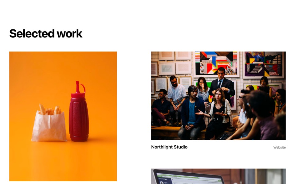
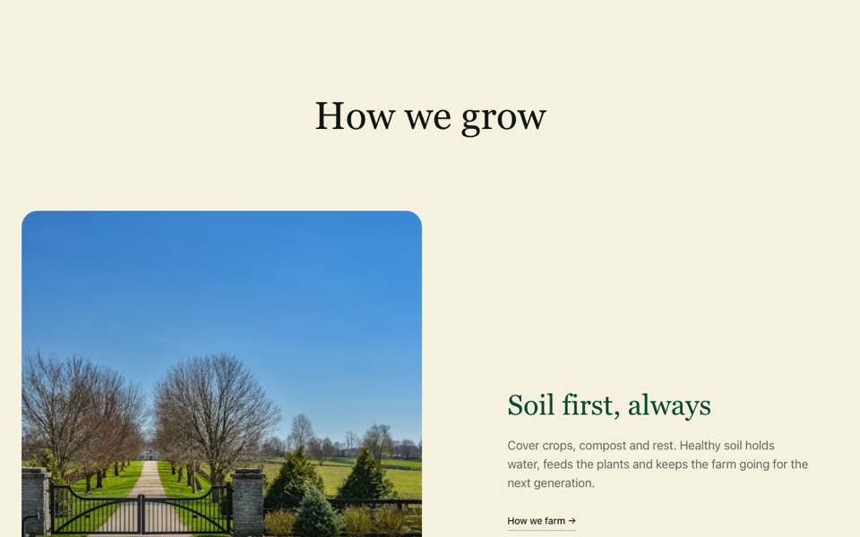
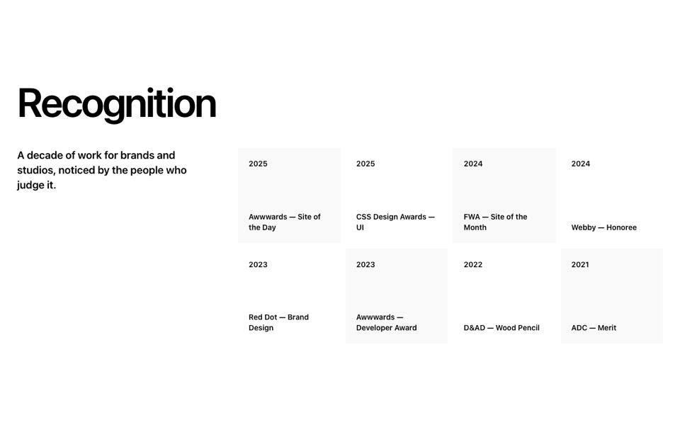
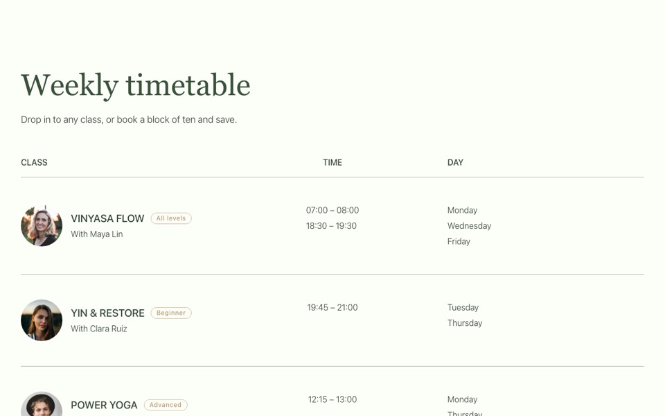
Process steps as tall photo cards with a white fade that alternates between top and bottom, on a grey panel. React and Tailwind CSS.
ProcessPhotoCards.tsx
// Process cards on a grey panel: tall photos with a white fade that keeps the
// text readable, alternating between the top and bottom of each card.
// Pure Tailwind, no dependencies. Works with Tailwind v3 and v4.

type Step = { title: string; text: string; image: string };

type Props = {
  heading?: string;
  steps?: Step[];
};

const img = (id: string) => `https://images.unsplash.com/photo-${id}?w=900&q=80&auto=format&fit=crop`;

const DEFAULT_STEPS: Step[] = [
  { title: "Discover", text: "Workshops with your team to understand the audience, the market and what makes you different.", image: img("1431540015161-0bf868a2d407") },
  { title: "Define", text: "A clear positioning and a visual direction we agree on before anything is polished.", image: img("1556761175-5973dc0f32e7") },
  { title: "Deliver", text: "Identity, guidelines and launch assets, handed over ready for your team to use.", image: img("1591115765373-5207764f72e7") },
];

export default function ProcessPhotoCards({ heading = "How we work", steps = DEFAULT_STEPS }: Props) {
  return (
    <section className="bg-[#f7f7f7] px-5 py-20 font-['Inter',ui-sans-serif,system-ui,sans-serif] text-black antialiased md:px-10 md:py-28">
      <div className="mx-auto max-w-7xl">
        <h2 className="text-[clamp(32px,4vw,56px)] font-bold leading-tight tracking-[-0.03em]">{heading}</h2>

        <ol className="mt-10 grid gap-8 md:mt-16 md:grid-cols-2 lg:grid-cols-3">
          {steps.map((step, i) => {
            const bottom = i % 2 === 1;
            return (
              <li key={step.title} className="relative flex aspect-[424/533] flex-col overflow-hidden">
                <img src={step.image} alt="" loading="lazy" className="absolute inset-0 h-full w-full object-cover" />
                <div aria-hidden className={`absolute inset-0 from-white to-transparent ${bottom ? "bg-gradient-to-t from-[16%] to-[48%]" : "bg-gradient-to-b from-[28%] to-[65%]"}`} />
                <div className={`relative p-7 ${bottom ? "mt-auto" : ""}`}>
                  <h3 className="text-2xl font-semibold">{step.title}</h3>
                  <p className="mt-3 max-w-[22rem] font-medium text-[#595959]">{step.text}</p>
                </div>
              </li>
            );
          })}
        </ol>
      </div>
    </section>
  );
}
How to use it
- Make sure your Next.js or React project has Tailwind CSS set up (v3 or v4 both work).
- Create
components/ProcessPhotoCards.tsxand paste the code. - Import it into a page and replace the sample text and images with your own.